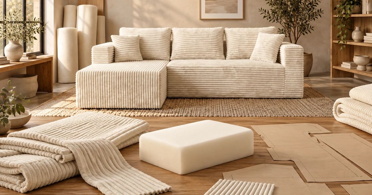
Ultione / Journal
Compressed Sofa Guides
Choosing a Compressed Sofa Color Online: Light, Screens and Texture
Choose a compressed sofa color by checking your screen, room lighting, fabric direction and the finishes you already own.
A cream-white compressed sofa can look bright in a product photo and warmer beside your oak floor at night. Choosing a color online gets easier when you separate three things: the image on your screen, the light in your room and the surface of the fabric.
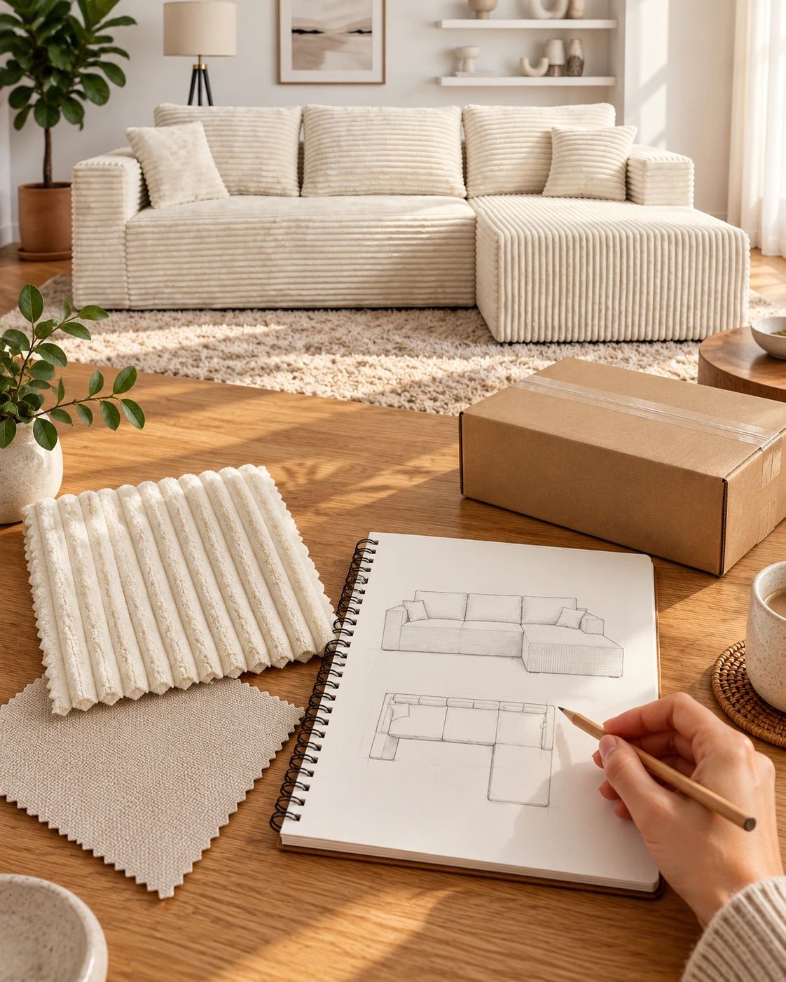
Start with the room you have. If you're considering ULTI ONE compressed sofas, compare the product's color options with your floor, walls and curtains before deciding which photograph you like best. A sofa occupies much more of your view than a little color tile on a phone.
 ULTI ONE compressed sofas
For a US or Canadian home, judge the sample beside the finishes you will keep and under the lamps you use after work, not only in the retailer's studio light.
Check what your screen is doing first
Before judging an off-white, look for a display setting that warms the image. Apple's Night Shift instructions explain that the feature shifts display colors toward the warm end of the spectrum. Turning it off temporarily removes one variable from your comparison.
Open the same product image on one device with consistent brightness. Avoid comparing one color in a dim screenshot with another in a bright, edited social post. Use the retailer's named color option and the corresponding product gallery so you know which version you are looking at.
If two photos disagree, identify what changed. Was one taken beside a window and the other under a lamp? Is one a close-up and the other an entire room? Has the fabric been viewed from another angle? Those questions are more useful than trying to average the colors of several unrelated photos.
Put the sofa beside the finishes that stay
Use the floor and the largest permanent finishes as your starting point. A pillow is easy to replace; a floor usually isn't. Choose whether you want the upholstery to blend with those finishes or provide a visible contrast.
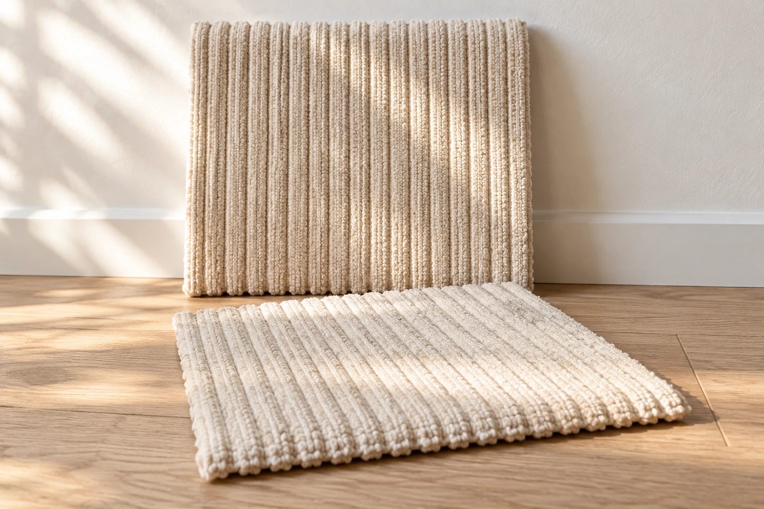
Beside warm wood, compare a pale sofa in daylight and evening light. Beside cool gray flooring, decide whether the warm off-white gives the contrast you want. Choose the relationship you like rather than treating one pairing as universally correct.
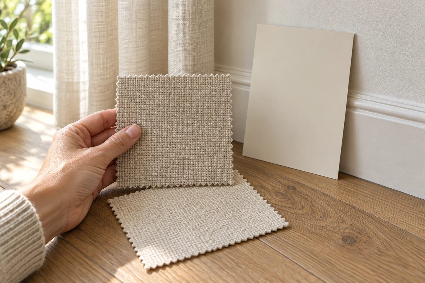
If the seller offers a sample of the exact upholstery and color, place it near the floor, wall and curtains together. Also hold it upright around the future back-cushion position. A sample lying flat on a table is being lit differently from an upright sofa back.
Check the lighting you actually live with
Look at your candidates when the room receives daylight, then again with the lamps you use in the evening. You don't need to recreate a photography studio. You need to find out whether you like the choice during the hours you spend there.
Textile manufacturer Coats explains in its color-evaluation guidance that lighting and background affect appearance. That's why selecting upholstery under one light and expecting identical appearance under every other light creates an unreliable comparison.
Turn textured upholstery before deciding
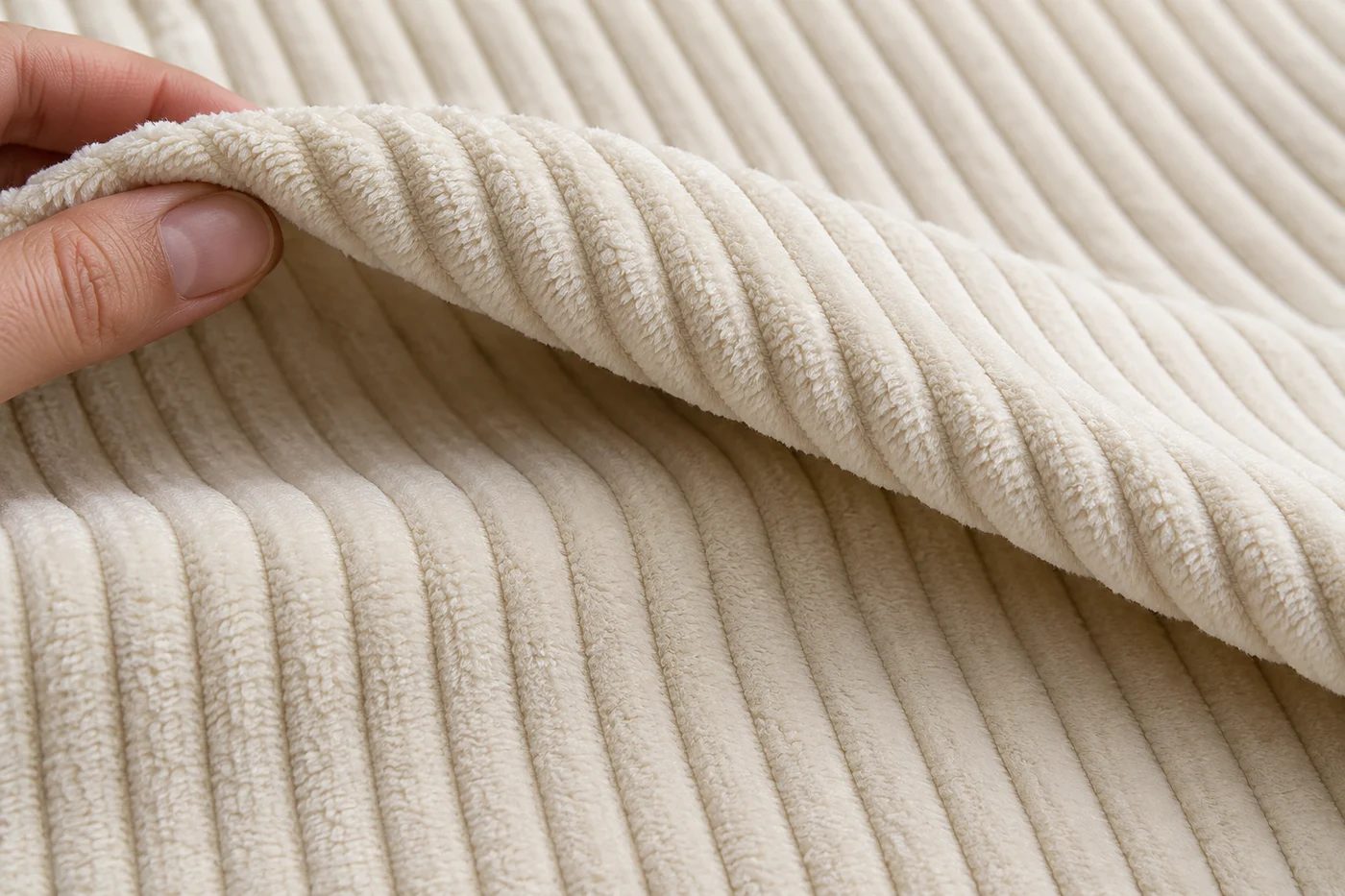
Wide-wale corduroy has raised ribs that deserve a close look. Check the surface, then step back far enough to see the texture as part of the furniture. A macro photo tells you about the ribs; the room view tells you how prominent they are.
Coats also explains that the angle of illumination and the viewing angle affect appearance. For textured upholstery, view a sample from both ends under unchanged lighting. Move your viewing position before deciding that a darker-looking section must be a different color.
For our coarse corduroy, use close-ups that show the wide ribs, not a generic fine-rib fabric. The L product page is the place to confirm the available color on the model you're considering. Check the exact configuration too; a color reference for another product doesn't tell you its arm shape or layout.
During production, fabric changes are compared for color and specification, and batches can be traced with the finished order. For an additional cushion or later cover request, keep the exact model, color name and original order details together. That gives the appearance question a specific starting point. A matching color name and a matching fitted component both matter to the final result.
If you photograph two candidates, keep the camera position and lighting steady. A production comparison and a household color choice answer different questions; the controlled ΔE check below explains the first.
Narrow the decision to two complete room choices
Imagine choosing between a warmer ivory and a cooler pale neutral beside an oak floor. In daylight, you like both. With your evening lamps on, you find the ivory blends with the wall more than you want, while the other sample gives you the contrast you prefer. That observation gives you a reason to choose the second candidate. It doesn't make either shade universally better; it connects your choice to the room you'll use.
When you're ready to compare the compressed sofa collection, keep your preferred color, model and configuration together. Save those details with your room notes so the color you choose is the one on the product you order.
Separate color consistency from the light in your room
Production checks use a color-difference target of ΔE ≤ 2 against an approved reference. Think of ΔE as the size of a measured difference under controlled conditions, not an exact promise about your phone screen. That helps keep panels consistent; your room's lamp, wall color and the direction of the pile still affect what you see.
Compare corduroy panels with ribs and pile facing the same way; flat seats and upright backs receive different light. For everyday upkeep, cream makes dark hair and crumbs more visible, while navy can show pale lint. Include that contrast in the color you choose.